by Team InDeepData
7704
Table of Contents
- What is Exploratory Data Analysis?
- Why is Exploratory Data Analysis Important?
- How to do Exploratory Data Analysis?
- Let’s dive into the Iris Flower dataset:
- Key points about the dataset:
- Balanced Dataset
- Imbalanced Dataset
- Scatter plot
- Pair plot
- Histogram and Density Curve on the same plot
- PDF(Probability Density Function)
- CDF (Cumulative distribution function)
- To plot a CDF and PDF
- To plot PDF and CDF for all class
- Mean, variance, and standard deviation
- Percentile
- What is a box and whisker plot?
- What is a violin plot?
- A 3D plot of the iris flower dataset
What is Exploratory Data Analysis?
In simple words: EDA is a process or approach to finding out the most useful features from a dataset according to your problem which helps you to choose the correct and efficient algorithm for your solution.
Why is Exploratory Data Analysis Important?
As we know there are some prerequisites for every project and we can say that EDA is a prerequisite process for any data science or machine learning project. If you are in a hurry and skip EDA then you may face some outliers and too many missing values and, therefore, some bad outcomes for the project:
- Wrong model,
- Right model on wrong data,
- Selection of wrong features for model building.
How to do Exploratory Data Analysis?
We can do EDA with programming languages and data visualization tools.
The most popular programming languages are:
- Python
- R
The most popular data visualization tools are:
- Tableau
- Power BI
- Infogram
- Plotly
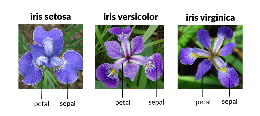
Let’s dive into the Iris Flower dataset:
To download the Iris flower dataset: https://www.kaggle.com/arshid/iris-flower-dataset
Key points about the dataset:
- The shape of data is (150 * 4) which means rows are 150 and columns are 4 and these columns are named sepal length, sepal width, petal length, and petal width.
- There is a species column that tells us about the label of the flower according to the given data there are three categories of flower named Iris setosa, Iris Verginica, and Iris versicolor.
- Dataset is having 33% of each category's data.
Now we are going to do EDA with the programming language named Python.
Python has a massive amount of libraries to apply the various types of operations on data to find out the best results.
Import some important Libraries.
# Import libraries
import numpy as np
import pandas as pd
import matplotlib.pyplot as plt
import seaborn as sns
The next step is to load data. if data is in CSV format then use these lines of code to load data into a variable named Data.
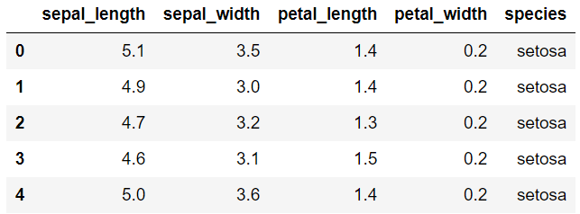
iris = pd.read_csv("iris.csv")To observe the top 5 rows of the data using the head function which gives the first 5 rows of the data.
iris.head()OUTPUT:
To check the last five rows of the data we can use data.tail() and for modifying the number of rows we can use data.head(3) or data.tail(3).
To check the dimensionality of the dataset
iris.shape()OUTPUT: The shape of the data is (150, 4)
To check the column names or feature names
iris.columnsOUTPUT: Index([‘sepal_length’, ‘sepal_width’, ‘petal_length’, ‘petal_width’, ‘species’], dtype = ‘object’ )
To check how many points of each class
iris['species'].values_count()OUTPUT: versicolor: 50, setosa: 50, virginica: 50
As we can observe all three classes are equally distributed in terms of the number of counts of each class.
Here we can understand a very interesting concept called balanced and imbalanced dataset.
Balanced Dataset
Let's say we have 10000 rows and it has 2 classes. and class A has 4000 points(point = row) and class B has 6000 points this dataset is a balanced dataset. (Examples: (5000, 5000), (5500, 4500), (6000, 4000)).
Imbalanced Dataset
Let's say we have 10000 rows and it has 2 classes. and class A has 2000 points and class B has 8000 points and this dataset is the imbalanced dataset. (Examples: (1000, 9000), (1500, 8500), (2000, 8000))
We aim to get a balanced dataset our machine learning algorithms could be biased and inaccurate if data is imbalanced. there are various techniques to handle the case of an imbalanced dataset you can go to this link
From the above explanation, you may get some idea about the balanced and imbalanced datasets.
Some Basic information about the dataset
iris.info()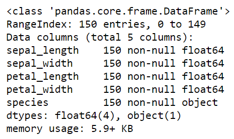
Observation:
Now we can say that there is not any data point missing in any feature. And all first 4 features are of float64 type which is used in numpy and pandas. And indexes are from 0 to 149 for 150 entries. And the last column is of type object which is used for the class labels. The memory used by this data frame is around 6 KB.
Some Visual views of data
# First plot
plt.plot(iris["species"])
plt.xlabel("No. of data points")
plt.show()

# Second plot
plt.hist(iris["species"],color="green")
plt.show()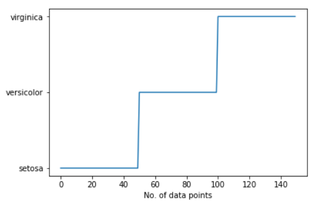
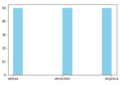
Here we see visually by plotting a graph by no. of data points of each class label.
To observe more about the data we can see a basic description of the data
iris.describe()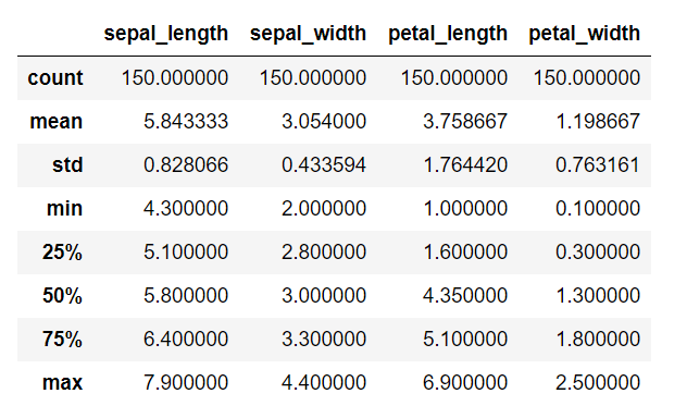
Observation:
By describing the dataset we can find out the overall mean, standard deviation, minimum and maximum values in each feature, 25, 50, 75 percentile of data distribution. And many more things in another dataset.
We can’t find any useful information in this dataset that tells us about a very useful feature that helps classify all three iris, and flower classes. To do that we can apply some other techniques to find out important features such as plots of various types.
Scatter plot
A scatter plot is a set of points plotted on horizontal and vertical axes. Scatter plots are important in statistics because they can show the extent of correlation, if any, between the values of observed quantities or phenomena (called variables). If no correlation exists between the variables, the points appear randomly scattered on the coordinate plane. If a large correlation exists, the points concentrate near a straight line.
This has come under bivariate analysis.
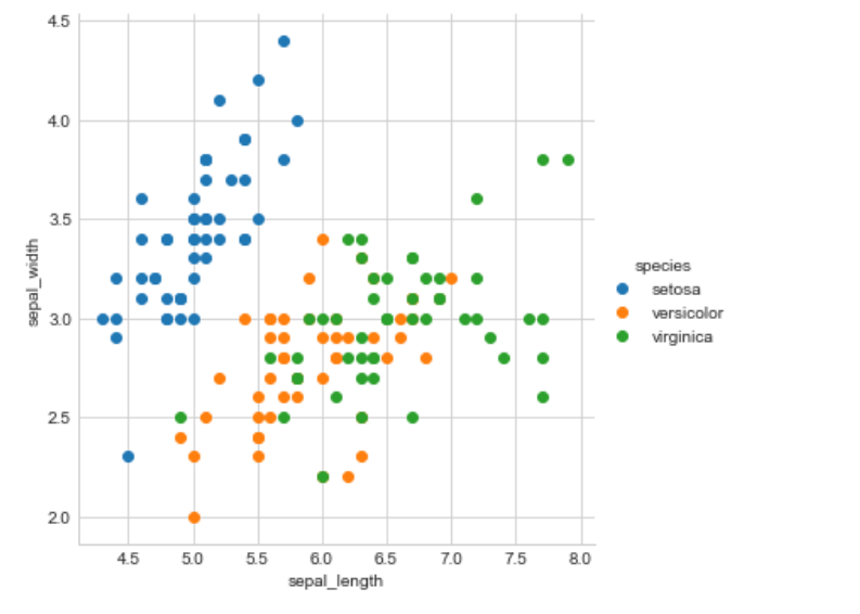
Observation:
Wow! Here we can see that blue color data points(setosa) are totally separate from the other two class data points by a straight line when we plot a scatter plot with the help of sepal length and sepal width. But the separation of Versicolor from Virginica is much harder because they are considered overlaps. To solve this problem we have to observe many other plots.
Here we have a scatter plot with only two features but we have to observe all pairs of the features (4c2 = 6) combinations to see all features in 2D space which is not a good practice and effective by doing one by one. So we have good news we can do it by a single line of code with a pair plot.
Pair plot
By default, this function will create a grid of Axes such that each variable in data will be shared in the y-axis across a single row and in the x-axis across a single column. The diagonal Axes are treated differently, drawing a plot to show the univariate distribution of the data for the variable in that column.
Disadvantage: we can not visualize higher dimension data like 10D data it is perfect for up to 6D data. And work only in 2D data. If you want to observe 3D scatter plot go to this link
This has come under bivariate data analysis.
sb.set_style('whitegrid')
sb.pairplot(iris,hue='species',size=3)
plt.show()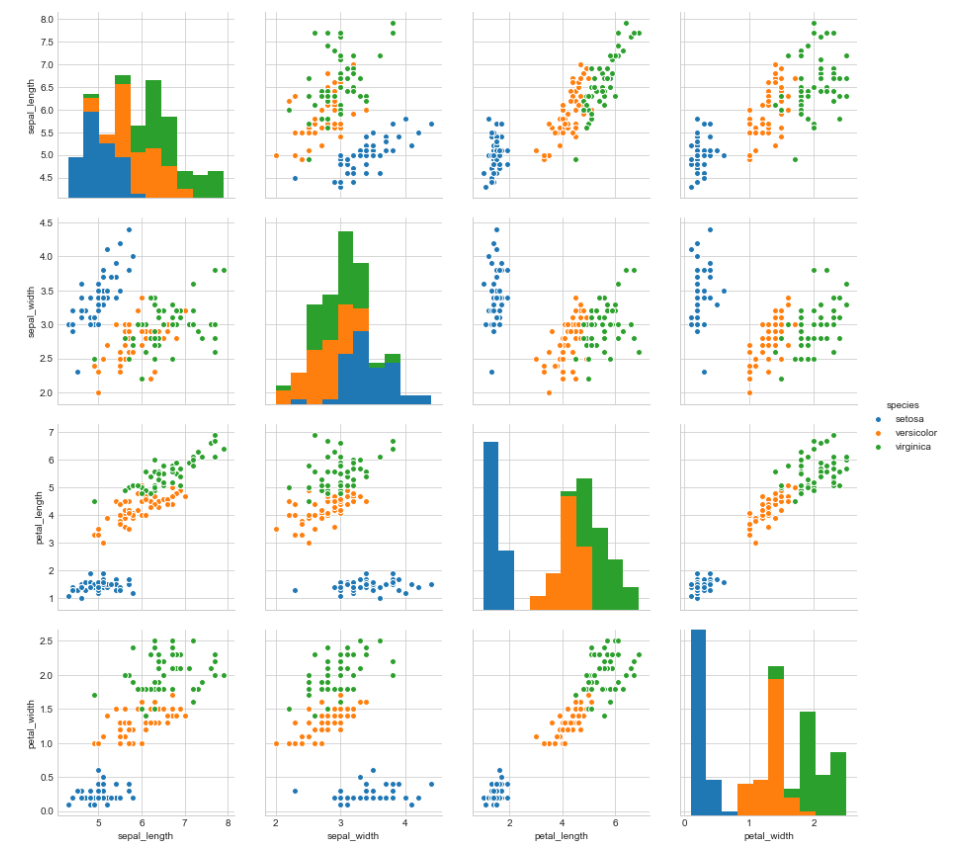
Observation:
We can observe from the pair plot that petal length and petal width are the most useful features to classify iris flower to there respective class.
Verginica and Versicolor are a little bit overlapped but they are almost linearly separable.
There are many other ways to know about the dataset if the above method is not work in any case.
Now we are going to study PDF, CDF, and HISTOGRAM.
Why do we need a histogram?
iris_setosa = iris.loc[iris['species']=='setosa']
iris_versicolor = iris.loc[iris['species']=='versicolor']
iris_virginica = iris.loc[iris['species']=='virginica']

plt.plot(iris_setosa['petal_length'],np.zeros_like(iris_setosa['petal_length'],),'o',label='setosa')

plt.plot(iris_virginica['petal_length'],np.zeros_like(iris_virginica['petal_length'],),'o',label='virginica')

plt.plot(iris_versicolor['petal_length'],np.zeros_like(iris_versicolor['petal_length'],),'o',label='versicolor')

plt.xlabel("petal_length")
plt.grid()
plt.legend()
plt.show()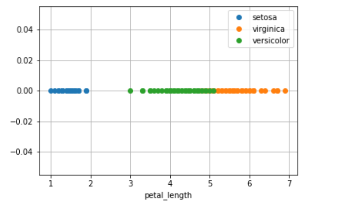
Observation:
The disadvantage of this 1D scatter plot is a lot of overlap between Versicolor and Verginica and we can not say anything about it.
To overcome this problem we need a histogram.
Histogram and Density Curve on the same plot
If you wish to have both the histogram and densities in the same plot, the seaborn package (imported as sns) allows you to do that via the distplot(). Since Seaborn is built on top of matplotlib, you can use the sns and plt one after the other.
This has come under univariate data analysis.
sb.FacetGrid(iris,hue="species",size=5).map(sb.distplot,'petal_length').add_legend()
plt.show()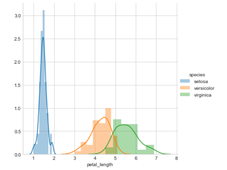
Observation:
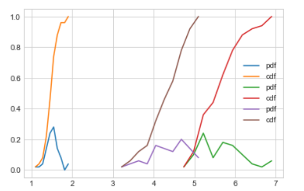
Its X-axis tells us all setosa flowers are having a petal length between 1 and 1.8. And Versicolor has petal lengths between 3 and 5.2 and Virginica have petal length between 4.5 and 6.9.
Its Y-axis tells us the count of the flower at this x value. or how often they come at this value.
And Setosa is fully separated from the other two classes but Versicolor and Virginica are not fully separated they have some overlap of some data points.
At x = 5 there is a high probability to get Virginica rather than Versicolor because the height of the Virginica histogram if larger than Versicolor.
And this smooth curve is called PDF (Probability Density Function). it is a smooth histogram.
PDF(Probability Density Function)
The PDF is the density of probability rather than the probability mass. The concept is very similar to mass density in physics.
OR
The probability density function (PDF) is a statistical expression that defines probability distribution as a continuous random variable as opposed to a discrete random variable. When the PDF is graphically portrayed, the area under the curve will indicate the interval in which the variable will fall. The total area in this interval of the graph equals the probability of a continuous random variable occurring.
For other features
sb.FacetGrid(iris,hue="species",size=5).map(sb.distplot,
'petal_width').add_legend()
plt.show()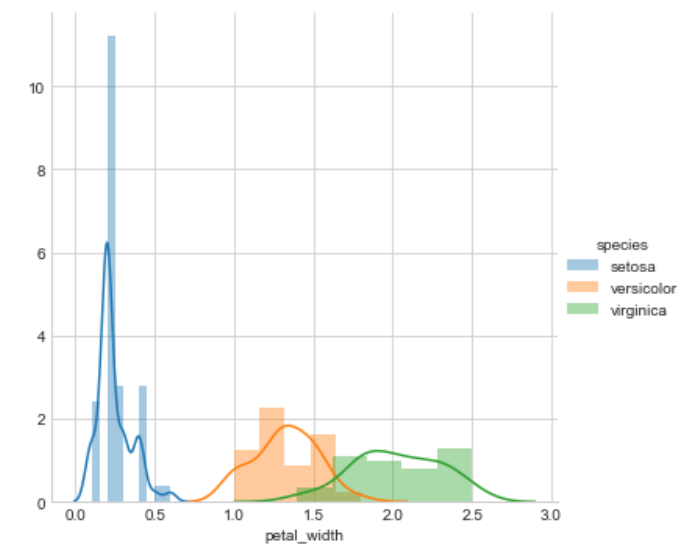
sb.FacetGrid(iris,hue="species",size=5).map(sb.distplot,
'sepal_length').add_legend()
plt.show()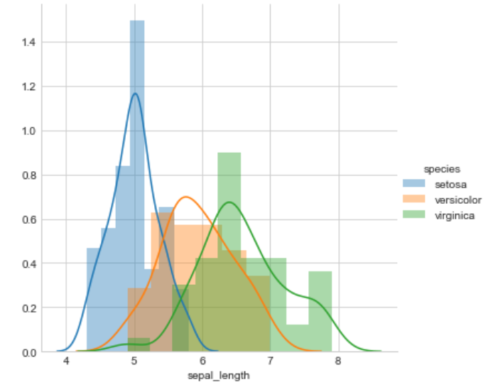
sb.FacetGrid(iris,hue="species",size=5).map(sb.distplot,
'sepal_width').add_legend()
plt.show()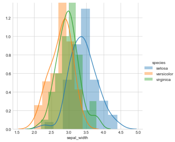
Observation:
Petal length will do a great job to classify all classes of flowers but we can say that petal length is slightly better than the petal width because petal width is also doing a better job.
sepal length and sepal width are not good features to classify iris flowers
petal length > petal width >>> sepal length >>>sepal width.
CDF (Cumulative distribution function)
In probability theory and statistics, the cumulative distribution function (CDF) of a real-valued random variable X, or just distribution function of X, evaluated at x, is the probability that X will take a value less than or equal to x.
To plot a CDF and PDF
counts,bin_edges=np.histogram(iris_setosa['petal_length'],bins=10,density=True)
pdf= counts/(sum(counts))
print(pdf)
print(bin_edges)

cdf=np.cumsum(pdf)

plt.plot(bin_edges[1:],pdf,label='pdf')
plt.plot(bin_edges[1:],cdf,label='cdf')

plt.legend()
plt.show()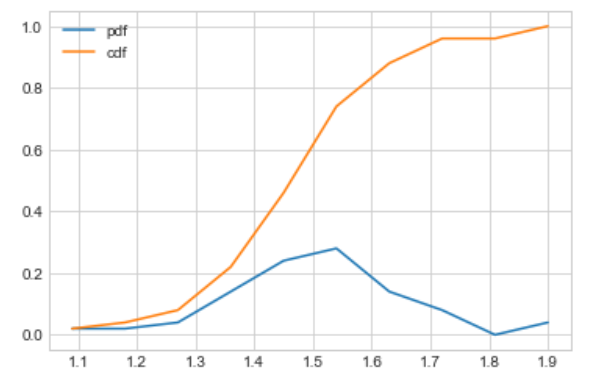
This is only for the setosa class petal length.
Observation:
Let’s take petal length is equals to 1.5 and then observe it by CDF and PDF.
Now we can say that 61% of setosa flowers having petal length is less than 1.5 or in another way we can say between 1.4 and 1.5 petal lengths we have 28% setosa flowers.
To plot PDF and CDF for all class
counts,bin_edges=np.histogram(iris_setosa['petal_length'],bins=10,density=True)
pdf= counts/(sum(counts))
print(pdf)
print(bin_edges)

# to compute cdf
cdf=np.cumsum(pdf)

plt.plot(bin_edges[1:],pdf,label='pdf')
plt.plot(bin_edges[1:],cdf,label='cdf')


counts,bin_edges=np.histogram(iris_virginica['petal_length'],bins=10,density=True)
pdf= counts/(sum(counts))
print(pdf)
print(bin_edges)

# to compute cdf
cdf=np.cumsum(pdf)

plt.plot(bin_edges[1:],pdf,label='pdf')
plt.plot(bin_edges[1:],cdf,label='cdf')

counts,bin_edges=np.histogram(iris_versicolor['petal_length'],bins=10,density=True)
pdf= counts/(sum(counts))
print(pdf)
print(bin_edges)

# to compute cdf
cdf=np.cumsum(pdf)
plt.plot(bin_edges[1:],pdf,label='pdf')
plt.plot(bin_edges[1:],cdf,label='cdf')
plt.legend()
plt.show()
Mean, variance, and standard deviation
To get more ideas about data.
# Means of the petal length
print("Means")
print("setosa",np.mean(iris_setosa["petal_length"]))
print("versicolor",np.mean(iris_versicolor["petal_length"]))
print("virginica",np.mean(iris_virginica["petal_length"]))

# standard-daviation
print("standard-daviation")
print("setosa      :",np.std(iris_setosa["petal_length"]))
print("versicolor  :",np.std(iris_versicolor["petal_length"]))
print("virginica   :",np.std(iris_virginica["petal_length"]))

# median
print("median")
print("setosa      :",np.median(iris_setosa["petal_length"]))
print("versicolor  :",np.median (iris_versicolor["petal_length"]))
print("virginica   :",np.median (iris_virginica["petal_length"]))
here if we talk about variance then this is a spread of how far our elements are spread (width of histogram’s graph)
We can observe various things by only one or two plots and the names of those plots are BOX plot and VIOLIN plot. but to understand these plots we have to understand the basic concept of percentile.
Percentile
x percentile tells us what % of data points are smaller than this value and what % of elements are greater than this value.
- The 50th percentile is the median.
- 25th,50th,75th, and 100th percentiles are called quantiles.
- 25th is a first, 50th is a second, 75th is a third, and 100th is the fourth quantile.
print("90th percentile")
print("setosa:",np.percentile(iris_setosa["petal_length"],90))
print("versicolor:",np.percentile(iris_versicolor["petal_length"],90))
print("virginica:",np.percentile(iris_virginica["petal_length"],90))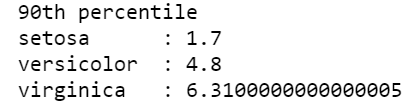
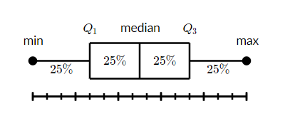
What is a box and whisker plot?
A box and whisker plot — also called a box plot — displays the five-number summary of a set of data. The five-number summary is the minimum, first quartile, median, third quartile, and maximum.
In a box plot, we draw a box from the first quartile to the third quartile. A vertical line goes through the box at the median. The whiskers go from each quartile to the minimum or maximum.
sb.boxplot(x='species',y='petal_length',data=iris)
plt.grid()
plt.show()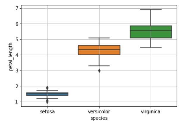
What is a violin plot?
A violin plot is a method of plotting numeric data. It is similar to a box plot, with the addition of a rotated kernel density plot on each side. Violin plots are similar to box plots, except that they also show the probability density of the data at different values, usually smoothed by a kernel density estimator.
sb.violinplot(x='species',y='petal_length',data=iris,size=8)
plt.grid()
plt.show()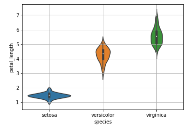
A 3D plot of the iris flower dataset
import plotly.express as px
fig = px.scatter_3d(Data, x='sepal_length', y='sepal_width', z='petal_width', color='species')
fig.show()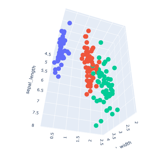
Thanks for visiting InDeepData